Autonomous Vehicle Dashboard & Infotainment
A concept exploration of two interface directions for next-generation mobility.
MARKET
Japan — leading EV adoption market
BENCHMARKS
Tesla, Rivian — dominant owned EVs in market
OUTPUT
Two concept directions — Standard and Premium tier
These observations weren't from primary user research with drivers, I want to be clear about that. They came from published
user feedback, owner reviews, and automotive UX criticism in the design community. That framing shaped the strategy, but
the next step in a real production project would be primary research with actual drivers.
Strategic Principles:
From the research, three principles guided the design exploration:
- Prioritize legibility and visual hierarchy for quick driver recognition
- Balance touch with contextual physical controls — not every action belongs on a screen
- Ensure smooth contrast transitions between day and night environments to reduce eye strain and maintain visibility
Overview
This concept study explores two interface directions for an autonomous vehicle dashboard and infotainment system.
The goal: design experiences that inspire driver confidence, support situational awareness, and visually express advanced mobility
technology in a minimal, human-centered form.
The project is a mix of automotive UX, digital product design, and systems thinking, a domain where interface decisions
have real consequences for safety, trust, and the user's relationship with autonomous technology.
Process
CHATGPT・FOUNDATION
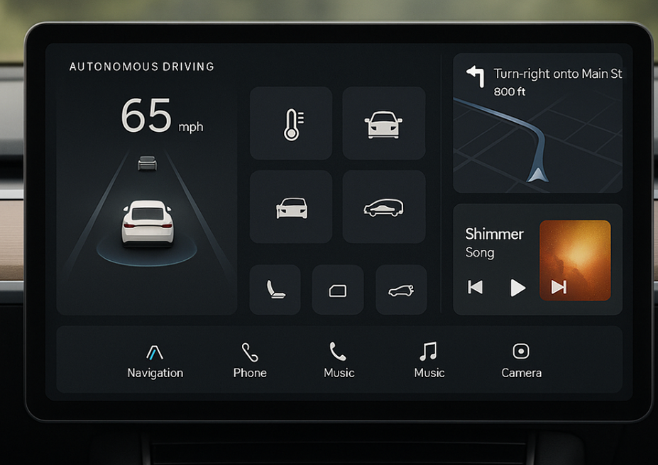
AI generated the initial layout to react to.
Prompted GPT with the context — EV dashboard, Japan market, autonomous driving as a primary use case — and asked it to generate a starting layout. The output gave me a structural foundation: information zones, primary controls, and a tile-based grid system. Rather than starting from a blank canvas, I started from something I could critique and push against.
AI OUTPUT
Initial dashboard layout with speed display, navigation zone, vehicle state panel, and media controls — the structural skeleton both concepts evolved from.
(As seen below "AI Foundation vs Final Direction")
COMPETITIVE RESEARCH ・TESLA & RIVIAN
Benchmarking the interface drivers already know.
Japan has the highest EV adoption rate of any market, with Tesla and Rivian as the dominant owned vehicles. Their UI patterns are what Japanese EV drivers are most familiar with — which means any new dashboard design has to earn departure from those conventions. I studied both interfaces for their information hierarchy, glanceability decisions, and how they handle the split between driving state and ambient features.
Tesla
Full-screen center display, minimal physical controls, navigation dominant. Sets the expectation for a single unified surface.
Rivian
Warmer, more modular layout. Driver assist more visually prominent. Media and comfort controls given equal weight to navigation.
FIGMA・TWO CONCEPT DIRECTIONS
Standard vs. Premium ー same simplicity, different tier.
Both concepts share a deliberate design constraint: simplicity over feature density. In-vehicle UI fails when it competes for attention. The differentiation between the two is tier positioning — not capability, but feel.
DESIGN DECISION
I chose to present two options rather than one recommendation — giving a product team or stakeholder a clear choice between positioning directions rather than pre-deciding for them.
AI Foundation vs Final Direction
Research Framing
I anchored the work in observed friction patterns from leading EV systems, primarily Tesla and Rivian.
Recurring user feedback highlighted three areas where current interfaces underdeliver:
- Discoverability: Functions buried in nested menus, requiring driver attention away from the road
- UI lag: Touchscreen-heavy systems where input delay erodes trust
- Touchscreen dependence: Over-reliance on visual targeting for actions that should be tactile or contextual
Concept A: Driver-Centric Navigation
(Standard)
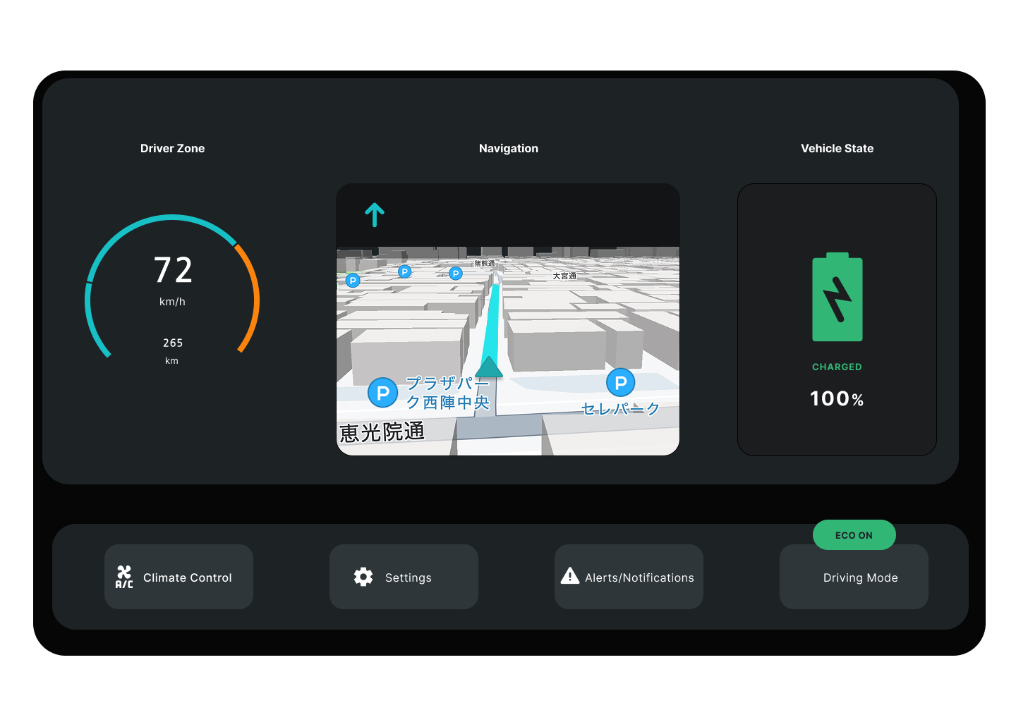
The first concept centers on real-time performance, navigation, and energy awareness — the information a driver needs at a glance during semi-autonomous operation.
Key design decisions:
- Circular speed gauge integrating range estimation directly into the speedometer. Consolidating critical glanceable data reduces eye movement and cognitive load during driving.
- 3D map that maintains situational context without visual clutter. The map shows enough environmental information to support confidence, but doesn't dominate the interface.
- Vehicle state panel with battery and charging status surfaced prominently — important context for EV drivers but often buried in current systems.
- Bottom utility bar for climate control, settings, alerts/notifications, and driving mode — frequent actions kept accessible without cluttering the primary view.
The intent:
A focused, calm interface that supports a driver in semi-autonomous mode without overwhelming them with information.
Concept B: Infotainment & Assistive Layout
(Premium)
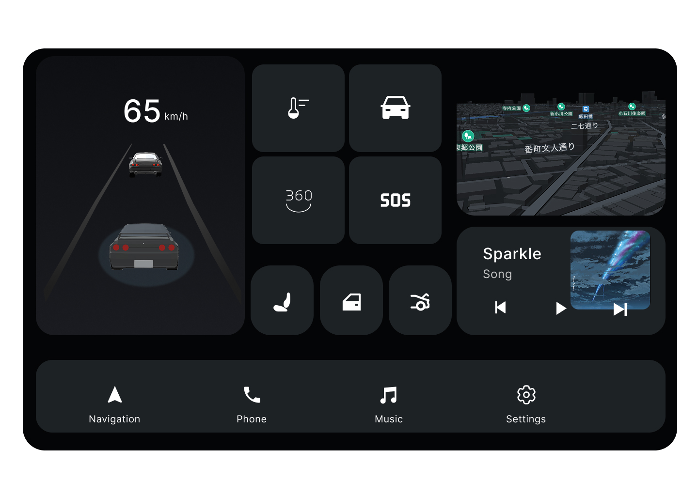
The second concept takes a modular approach. Each tile functions as a micro-app that can expand contextually, allowing the system to adapt to what the driver or passenger needs in the moment.
Key design decisions:
- Contextual expansion: tiles can grow or recede based on driver attention and trip context
- Bottom navigation bar: with persistent shortcuts for navigation, phone, music, and settings — predictable access to high-frequency functions
- Modular grid: integrating entertainment, vehicle assist visuals, and environment awareness without forcing a single primary view
- Speed and orientation data: retained in a fixed zone, ensuring critical information is always visible regardless of which apps are active
The intent:
Flexible engagement without distraction, supporting both driver and passenger use cases as autonomous capabilities increase the time available for non-driving activities.
Principles in Practice
Both concepts share underlying principles even as they explore different layouts:
Safety through clarity.
Simplified visuals reduce cognitive load and enhance recognition speed. Information density is calibrated to what a driver can process in a glance, not what could theoretically be displayed.
Emotionally calm interface.
Soft contrast, considered spacing, and motion cues promote trust during autonomous transitions. The interface should feel like a confident system, not an anxious one.
System scalability.
The visual language is designed to extend across cluster displays, infotainment screens, and heads-up displays. A modular foundation allows the same design system to scale across the mobility ecosystem.
What I'd Do Next
If this work continued toward production, the natural next steps would be:
- Primary user research: with drivers across experience levels, vehicle types, and use contexts to validate or challenge the assumptions I made
- Motion and interaction prototyping: static frames can't fully express how the interface feels in transition. The day/night contrast principle, for example, only proves itself in animation.
- Hardware constraint integration: real automotive interfaces are shaped by display technology, processing constraints, and physical control surfaces I didn't fully account for in concept form
- Accessibility considerations: color contrast, text sizing, alternative input modes for drivers with varying abilities
This project taught me that automotive UX is a domain where good design has consequences that go beyond engagement metrics. It's the kind of design problem space I want to continue working in.